
· By Sajeevan (Saj) Veeriah
Systems engineering · 5 min read
The hidden cost of keeping every machine busy
What Little's Law and a simple queue model reveal about work in progress, waiting time and where automation can actually help.
A machine finishes each operation faster after an upgrade. Orders still take days to get through the workshop. Both observations can be true: the operation improved, but most of the elapsed time may be spent waiting elsewhere.
This is a useful problem to examine before automating another step. The same question applies to a review inbox, a test bench or a software job queue: how much work is inside the process, how quickly does it leave, and where does its time go?
Draw the boundary around the promised result
For a fictional inspection service, define entry as the moment a job is accepted into the service and exit as the moment its result is released. Everything between those points counts towards the customer's flow time: waiting, processing, holds and any rework before release.
If the dashboard starts its clock only when the test bench becomes free, it measures a different promise. The reported number can improve while the customer's wait remains unchanged.
Choose one population and boundary before calculating. Do not combine the backlog for all jobs with the completion rate for only one easy category. Count cancelled and rejected jobs consistently, and keep their outcomes visible.
Turn work in progress into elapsed time
Little's Law relates average work in progress L, average throughput λ and average time in the system W: L = λW. MIT's supply-chain material presents the same relationship as inventory = throughput rate × flow time.
Suppose the fictional service has a time-average of 12 accepted but unreleased jobs and completes an average of 4 jobs per hour over a representative stable period. Its average flow time is 12 / 4 = 3 hours. That result includes waiting and processing inside the chosen boundary.
If the bench needs only 10 minutes of active work per job, an operation-time chart cannot explain the whole three hours. Investigate the gaps: batching, approvals, unavailable fixtures, rework or a downstream release queue. Those are candidate explanations to measure, not conclusions from the equation.
Use averages from the same population and a period that represents its operation. A one-off backlog snapshot is not a time-average. A rapidly growing backlog also needs a transient analysis; do not present a steady-state calculation as a reliable completion forecast.
A simple model explains the steep part
Consider an M/M/1 queue: one server, independent Poisson arrivals, independent exponentially distributed service times, first-come-first-served handling and an unlimited waiting room. Assume steady state, with the arrival rate below the service rate. This is an analytical illustration, not a description of every factory.
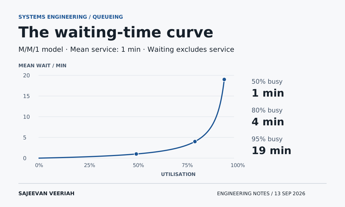
Let the mean service time be one minute, so the mean service rate µ is 60 jobs per hour. Utilisation ρ is arrival rate divided by service rate. For this model, mean waiting before service is Wq = ρ / (1 - ρ) × mean service time.
| Utilisation and arrivals | Modelled mean waiting before service |
|---|---|
| 50%; 30 jobs/h | 1 minute |
| 80%; 48 jobs/h | 4 minutes |
| 95%; 57 jobs/h | 19 minutes |
The service itself still averages one minute in every row. Total time in the system is therefore 2, 5 and 20 minutes respectively. As utilisation approaches 100%, this model has less spare capacity to absorb random bursts and long jobs. Its mean wait grows without bound.
Real processes can have bounded buffers, scheduled arrivals, several servers, breakdowns or very different service-time distributions. The numerical curve changes with those assumptions. The lesson to investigate is the effect of variation and spare capacity, not a universal rule that every process must target 80%.
Sources: [2]
Choose the change against the actual constraint
In a separate simplified serial process, imagine an upstream operation capable of 60 jobs per hour feeding a downstream operation capable of 40. Assume one job follows the same route, both rates already represent usable capacity, and demand is sufficient. Increasing the first operation to 90 cannot by itself raise the downstream limit above 40. Releasing more work can instead build a queue.
That does not mean the upstream upgrade has no value. It might reduce labour, support another product or provide useful recovery capacity. Those benefits need their own evidence. A local speed increase is simply not enough to establish an end-to-end throughput increase.
A work-in-progress limit can make overload visible and prevent unlimited release into a constrained process. It cannot create missing capacity or erase demand. Record work waiting outside the limit as well, so an apparently cleaner internal queue does not conceal a longer customer wait.
Measure one job all the way through
Capture accepted, ready-for-service, service-start, service-end and released times against a stable job identifier. Add explicit hold and rework events where needed. For physical equipment, collect observations through approved interfaces; this analysis does not require changing machine interlocks or operating limits.
| Measure | Why it belongs in the review |
|---|---|
| Throughput and time-average work in progress | Connect output rate with how much work remains inside. |
| Waiting and active service time | Show whether faster execution addresses the dominant delay. |
| Median and high-percentile flow time | Reveal long waits that an average can hide. |
| Rework, false rejects and cancellations | Check whether apparent speed comes from shifted work or poorer quality. |
Compare a representative baseline with the changed process, using comparable job mix and operating conditions. Track the queue beyond the improved step. If it simply moves downstream, report that movement.
Little's Law is an accounting relationship, not a causal guarantee. Deleting half the visible backlog does not prove that useful flow time has halved; the throughput or system boundary may also have changed.
A worthwhile automation proposal should name the delay it expects to remove and the end-to-end measure that will show whether it did. “This machine is busier” is a useful observation. “The customer receives the correct result sooner” is the outcome to test.
Sources and further reading
Sources checked on 13 September 2026. All service, capacity and queue examples are invented teaching cases. The M/M/1 results are calculated steady-state means under the stated assumptions, not measurements, guarantees or a universal utilisation target.